I have been anticipating this reveal for a LONG time now! Anyone who follows along with me on Instagram probably recognizes the #clientneutralfun stairs; you know, the stairs that appeared on my Stories nearly every time I went on-site, lol. What can I say, I was just so excited about them that I couldn’t resist sharing! And as beautifully as the stairs turned out, they’re just the “tip of the iceberg!” in this gorgeous renovation!!
Similar to the Lakeview Condo, I was pregnant for the majority of this project… The funny thing is that the clients were also expecting when we met for the first time! In fact, this lovely family welcomed their second child just 3 days before signing their construction contract with Miter Renovations!! To say that they are fearless is an understatement! And needless to say, the Mrs and I made quite the pair attending our various selections meetings together - her with her (very new) newborn in tow and myself, well into my third trimester, ha! In all seriousness though, this family handled the stress of a moving to a different province, a full renovation, and the addition of a new baby look like piece of cake (I’m not saying it was, but they were such champs that it sure appeared that way!). And did I mention that they also have a preschooler?!? AND that they were also always a joy to be around?!?!? They were honestly such troupers and they really inspired me as I prepared to welcome Atticus into the world 😊
For this job, we focused on the primarily on the main floor. The upper floor has 2 bathrooms which were remodeled fairly recently, so other than new carpet, light fixtures and a fresh coat of paint, there really wasn’t much to change up there. The basement required about the same, with the addition of a full remodel of the 3-piece bathroom down there. We updated the whole bathroom, including a new vanity, shower (the wall tile is AH-mazing), and floor finish. Although it has no natural light – and the ceiling is actually fairly low – it feels SO much better in there!
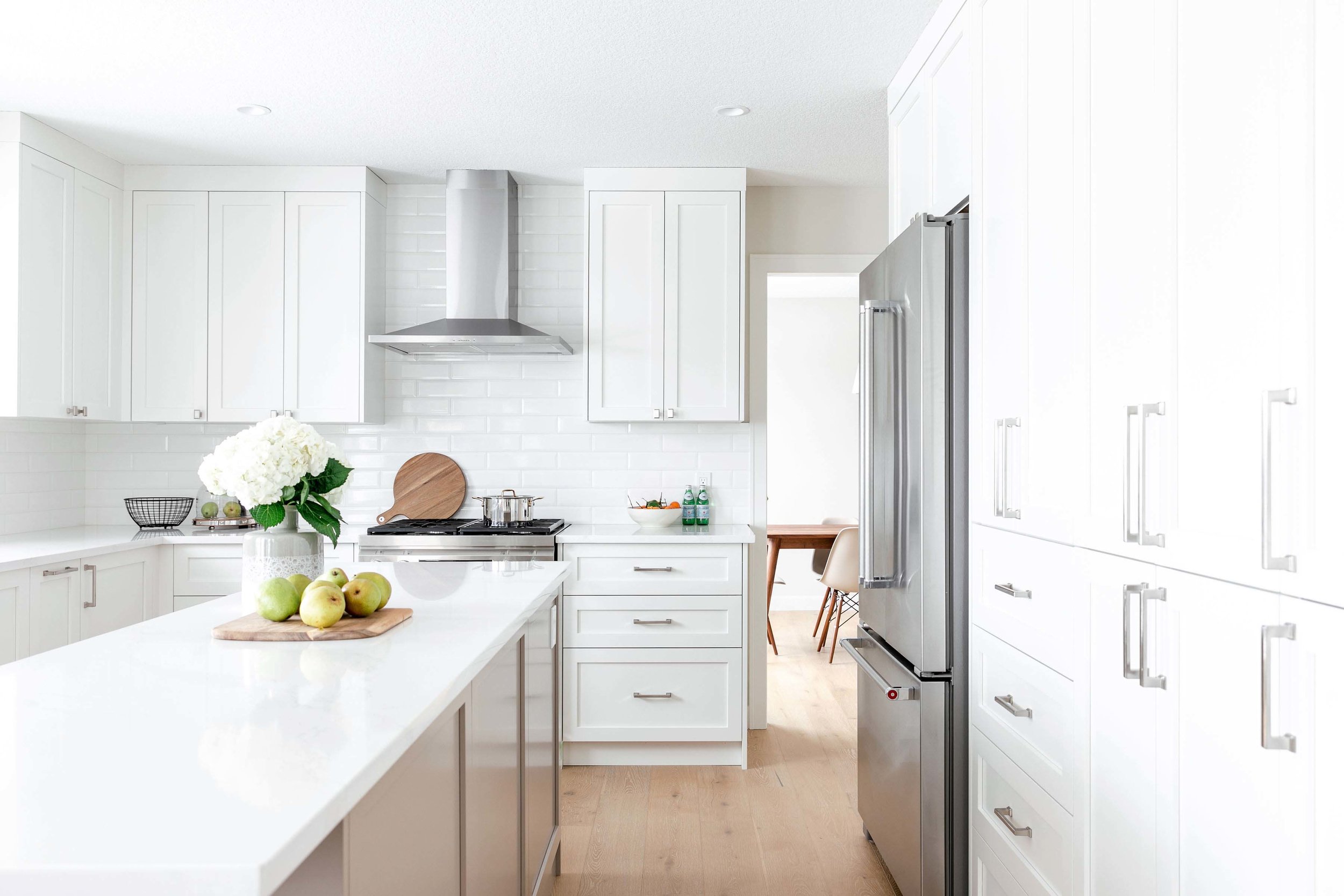
When it came to the main level, we didn’t move much around. The general layout of spaces was actually pretty good; other than removing a few non load-bearing walls and railings to open things up, and tweaking a few details in the Mud Room zone, we kept the spaces more or less in the same configuration. Even in the kitchen, which looks SO much different than it did prior to starting the renovation, the layout remained relatively consistent. In the kitchen it really was the removal of the sunshine ceiling (I’m sorry, I know these were super-popular 20-30 years ago but WHY?!? ), and the replacement of the heavy red oak cabinets with new bright + white shaker-style ones that really provided the biggest impact. We updated the kitchen island as well – we nixed the existing island stovetop in favour of a beautiful new range located where the previous wall ovens were. We also opted for a “two-tone concept” where all the perimeter cabinets were finished in white, and the island was finished in beautiful, warm neutral. The tonal shift is subtle, but I think the impact goes a long way in breaking up the white on white on white, especially since both the countertops AND backsplash were – you guessed it! – white.
Two other components that make this kitchen so special is the beverage station and the built-in bench at the breakfast nook. What is now the beverage station was once a small-ish, awkward-ish walk-in-pantry. We knocked down the pantry walls and relocated all the pantry storage to a “built-in” solution at the kitchen perimeter. Not only is this a much better use of space, but the full-height cabinets gave us a clean aesthetic and – more importantly – the clients now have a dedicated space for a beverage station to suit life’s 2 greatest necessities: coffee + wine 😉 I love this little spot – it has a small bar fridge, and can double as a modern “butler’s pantry” as it is located directly adjacent to the formal Dining Room. I particularly love the mesh detail we used at the upper cabinets at this location. We painted the mesh white so it’s still neutral, but the texture and material change add a lot of visual interest and a bit of “fun” (this is actually what inspired the project’s hashtag, #clientneutralfun)!
The breakfast nook is light-filled, bright and beautiful. Although Calgary is undoubtedly a winter city, we do have the luxury of lots of sunshine-y days – even during the coldest months, thank goodness! – so we tried to take advantage of that. We designed a custom built-in bench here which not only suits the irregular shape of the space, but also makes circulation to the back door more convenient. If I had my way, I’d eat ALL my meals in a space like this!!!
Other than removing the red oak wall paneling, built-ins and dated railing, we didn’t do much work in the Family Room other than update the fireplace. I love the fireplace insert that the client went with (mostly because I’m a sucker for the herringbone brick pattern) and the new mantel + surround look fresh and tie in nicely with the adjacent kitchen millwork. I usually despise televisions in main living spaces but my clients have my dream TV: one that poses as art when not in use – PLUS you can change the “art” / image whenever you like! Now that’s a TV I can get behind 😊
The Mud Room, Powder Room and Laundry Room are conveniently all located together, so we switched up the flooring here for a grey tile and updated the millwork. Prestige built us a both lovely and functional built-in bench at the garage entry and a small black vanity in the ½ bathroom. It was very difficult to photograph the Powder Room because it is very small but TRUST ME, the black vanity paired with brass cabinet pulls and light fixture looks awesome!!
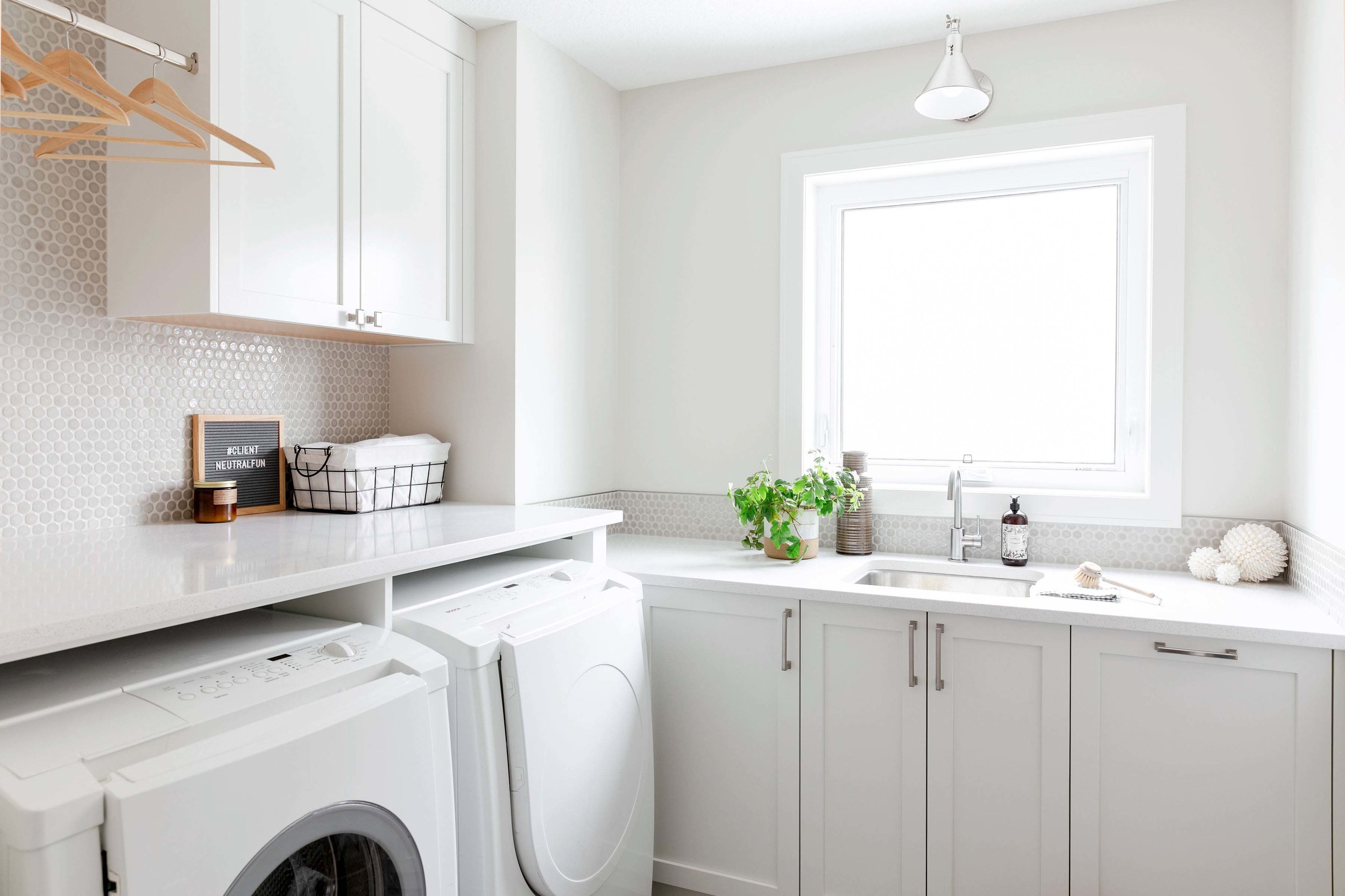
This Laundry Room is definitely my favourite that I have ever designed – in fact, it’s one of my favourite spaces period that I have ever designed, which I never thought I’d say about a space with a washer and dryer, haha. It is still relatively simple, but the space has a sweet little window where we centered a sink + wall sconce and we “splurged” on the real highlight (for me at least!): the penny tile backsplash! I love love LOVE penny tile and have for a long time, but I generally find that due to its small scale (and often heftier price per foot) it can be overwhelming in a kitchen. This Laundry Room was the perfect place for it and I couldn’t be more pleased with how it turned out. We went with a warm neutral tone and once again, I feel this “neutral fun” detail elevates the design substantially.
Lastly is the stairs… The curved staircase was existing and the first time I set foot on site, I was salivating just thinking of the potential, lol. We didn’t touch the structure, but we certainly got rid of the red oak wall paneling (bye!), updated the balustrade and swapped out the existing carpet for the gorgeous white oak hardwood flooring. The client and I were both in immediate agreement that we wanted to go for the black metal “hoop” look. We explored a few options but ultimately went for 2:1 ratio of straight metal rods to hoop. Since the hoops really are such a showstopper, we keep our handrail very simple – we even opted to skip newel posts! – and I’m so glad we did. I love the clean, modern look of the stained white oak baluster contrasted with the pattern created by the hoops!
As always, a huge thanks to an incredible team who made this project possible: Brendan of Miter Renovations and all the subtrades, Lauren of LP Design for the construction drawings, and Jamie of Jamie Anholt Interiors for these gorgeous images! I’m very proud to have been a part of the evolution of this beautiful home that couldn’t go to a more deserving family 😊


